Designing a Utopian layout grid: working with fluid responsive values in a static design tool
A layout grid is a useful aid for a designer organising information in a given space. Although these grids have their roots in print design, where dimensions are fixed, fluid layout grids still have some utility in responsive design.
This post aims to contextualise the Utopia fluid grid calculator which helps you to define a layout grid by clicking a few buttons.
Layout grids: good for the broad strokes
Although each of our users’ experiences will vary slightly according to their devices and settings, grids help us position our basic content areas predictably across pages, and consistently align certain aspects of an interface. For example, a main content area and a sidebar, or three equal-width columns of content.
With modern CSS, layouts like these can be achieved on-the-fly with display properties like flexbox and grid, without needing to first create persistent grids made of columns and gutters. In a design tool, though, it’s helpful to set up an underlying grid for reference to keep our designs neat and consistent.
There’s a good write-up at gridless.design describing why we might prefer flexible, proportional spacing over a series of fixed columns when we’re building for the modern internet. For designers working in tools like Figma and Penpot, though, layout grids remain a helpful way to design with consistent spacing.
Declarative design
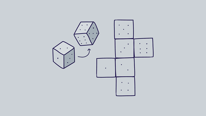
Utopia is a declarative design approach, where we describe some rules and let the browser interpret those rules according to its current situation. In 2022 our design tools are still based around fixed-size artboards, while we’re trying to design products which scale gracefully to suit any screen. It’s like trying to draw all six sides of a 3D cube on a flat surface: we can either draw the cube unfolded, or from multiple angles. Our communication options are limited by the medium. Our only option with current design tools is to draw our designs at multiple viewport widths because an artboard doesn’t (yet) behave like a real browser viewport. This is true of breakpoint-based design as well as fluid responsive design, but because Utopia is declarative, we only need to visualise the smallest and largest states, which we call @min and @max. Everything in between will be displayed according to the rules we set.
Utopian projects include two layout grids, which are really the two poles of a single grid. We’re looking at the same thing through two different viewports: one small, and one big.
Getting started: designing the grid
I’ll describe my process in a series of steps although the reality is much messier. Reviewing typefaces, type scales, content, and components is an ongoing process. Over the course of a project we’ll be looking to bring all of these related factors into balance.
We’re aiming to design a grid that smoothly flexes between a small screen and a large screen like this:
Step 0: define your body text size and generate a space palette
One of the first — and most important — design decisions on any project is what the majority of the text will look like. Depending on a unique combination of factors including content, audience, and style, a designer needs to specify a handful of properties for the main body text, including a suitable font, weight, size, line height, and perhaps letter spacing. This is the visual voice in which the majority of information will be communicated. The size of this text is the heart of the Utopian system: the centre of gravity around which everything else will orbit. It usually grows with the viewport width but it could also be a fixed size. In any case, we call this value “step 0”.
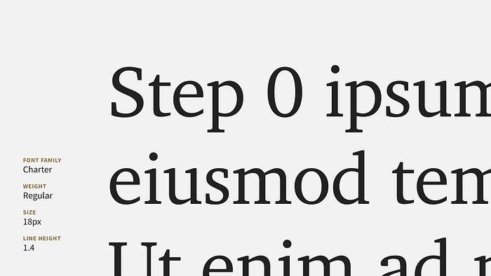
The fluid type scale calculator takes that body text size and scales it up and down to generate a series of size tokens. I wrote a blog post about designing with fluid type scales.
The fluid space calculator takes that body text size and scales it up and down to generate a palette of related size tokens to use in your designs. I wrote in detail about designing with a fluid space palette in another blog post.
NOTE: Although this post is about the horizontal spacing of the layout grid, the same Utopian values can be employed to ensure a design’s vertical rhythm stays in tune and the layout will look neat on any screen.

1. Choose @min viewport width
A good place to start designing a grid is to decide on a @min viewport width. This doesn’t need to map to a particular device. Because Utopia will scale a design up to suit any viewport, it makes sense to design the @min screens as small as is practically possible. Lots of us used 320px phones for years without problems so I generally start around there, even though that’s small by today’s standards. If a design works at ~320px, it’ll probably work everywhere it needs to.

NOTE: It’s worth remembering that a small viewport doesn’t necessarily mean a small device. A user might be looking at multiple windows on a tablet or an ultrawide desktop monitor. We’re aiming to make our content accessible in as many situations as possible.
2. Choose a number of columns
Because we’re designing two views of one grid, the number of columns will remain constant. How and when a design conforms to this is for you to decide. The number of columns will depend on the specifics of each project. If you’re not sure, a 12-column grid is practical because it divides evenly into 2, 3, 4, and 6-column layouts. It also offers plenty of options for uneven layouts, for example, a 9-column main content area with a 3-column sidebar. Almost all of my projects use a 12-column grid.
3. Choose @min gutter size from your space palette
Gutters are the spaces between the columns. How much space would look appropriate around and between the parts of your design? Would your content be better served by a dense, tightly-packed grid, or something more spacious and relaxed? Try doing some quick experiments in your design tool to get a feel for what works. You can always change your mind later when you have more content and components to work with. Most of the projects I work on use the step 0 value for the gutter size at the @min viewport width.
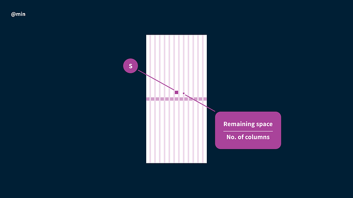
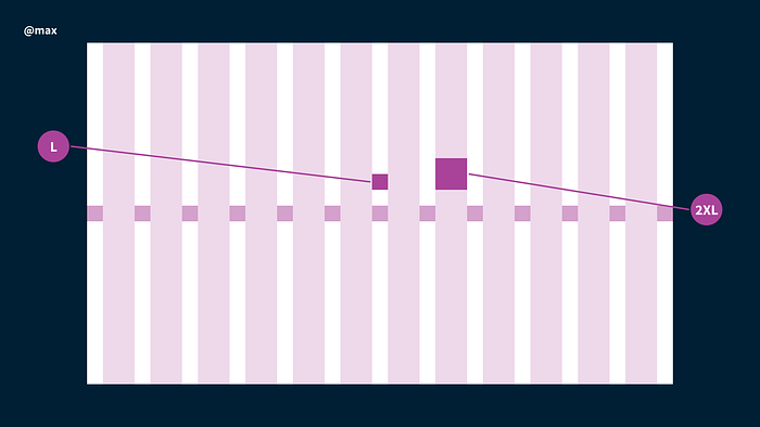
4. Choose @max viewport gutter and column widths
When designing the large-screen end of the grid, the viewport size is unlikely to be a constraint. It’s up to you to choose gutter and column sizes to best show off your project’s content. Instead of deciding on an arbitrary container size and trying to fit a grid inside it, you can let your main content container width be the total of the space palette values you choose. When the site is built, the space palette CSS will ensure that in any viewport smaller than the container’s max width, the spacing will be in tune.
If you’re already second-guessing your body text size decision, you’re doing this right. It’s all a balancing act. For example, to design your perfect line length you need to know your text size and how much space is available. To know how much space is available, you need to know your gutter size at the viewport width you’re designing for. To know the gutter size you need to know your step 0 size. To know your step 0 size you need to know how much space is available. The way forward is to make some educated guesses and continue to review your decisions as your design progresses.
5. Calculate your design tool viewport widths
There’s a good chance your column number and gutter size won’t magically add up to exactly the width of your nominated @min viewport width. If that is the case, and you add these figures to Figma’s Add layout grid panel, you’ll end up with an uneven, lumpy grid. Figma splits the difference across all the columns to maintain whole-pixel values. That does make sense but it’s not what we want, because the whole point of this grid is to make our designs neat and regular.
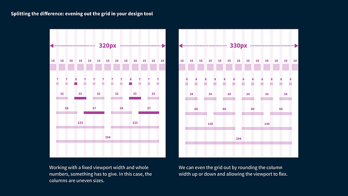
Utopia is device agnostic and I’d prefer to design on an even grid with whole-pixel values, rather than an uneven grid in a specific viewport size. The way I achieve that is to round up all column sizes and accept that that will make my viewport width something close to — but not exactly — 320px. I then make my Figma artboards the rounded-up width. The fluid grid calculator will offer to round the @min column value up or down. It will then also offer to adjust your viewport width to match. It’s up to you whether you use the original or the rounded-up number as your @min CSS value when it comes to building the site. In most cases it shouldn’t make a significant difference.
For the @max artboard size, choose how much space the content container will sit within. It often looks neater to crop the artboard close to the sides of the main content area. In reality it’s quite common for people using bigger screens to see the design with more space either side and developers will need to know how edge-to-edge components should scale when the browser window gets really wide.
Design stuff
Now you have the first version of the fluid container in which your designs will live. You can start testing your fonts to see what type scales play nicely with your grid. How big can your headings be at the small end before they start to wrap too much? What levers can you pull to address that? Font size? Letter spacing? Gutter size? How many type scale steps do you need to achieve the dynamics you want across the viewport range? How many columns should your primary content span? Are your line lengths reasonable? All of these decisions are part of the Utopian balancing act.
Each time you add or update an element in your @min design, make the same change (scaled, of course) to your @max design, and vice versa.
Don’t think of @min and @max as two separate designs — but as two aspects of the same design.
This was originally posted on the Utopia blog.
